Nothing Speaker - (1) [concept]:
Key take-aways:
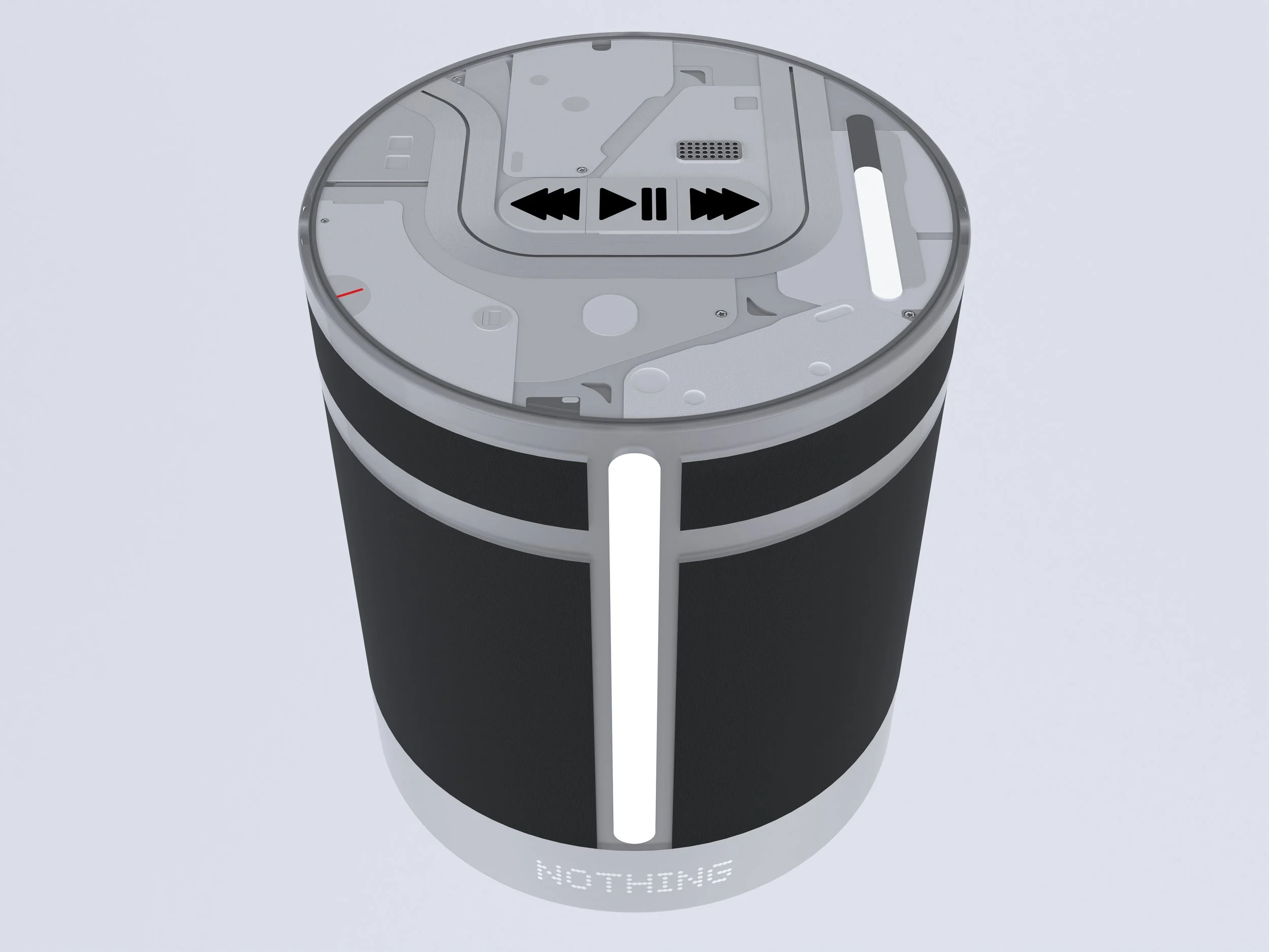
This self-directed project looks at what a home smart speaker might look like in the style of the Nothing design company.
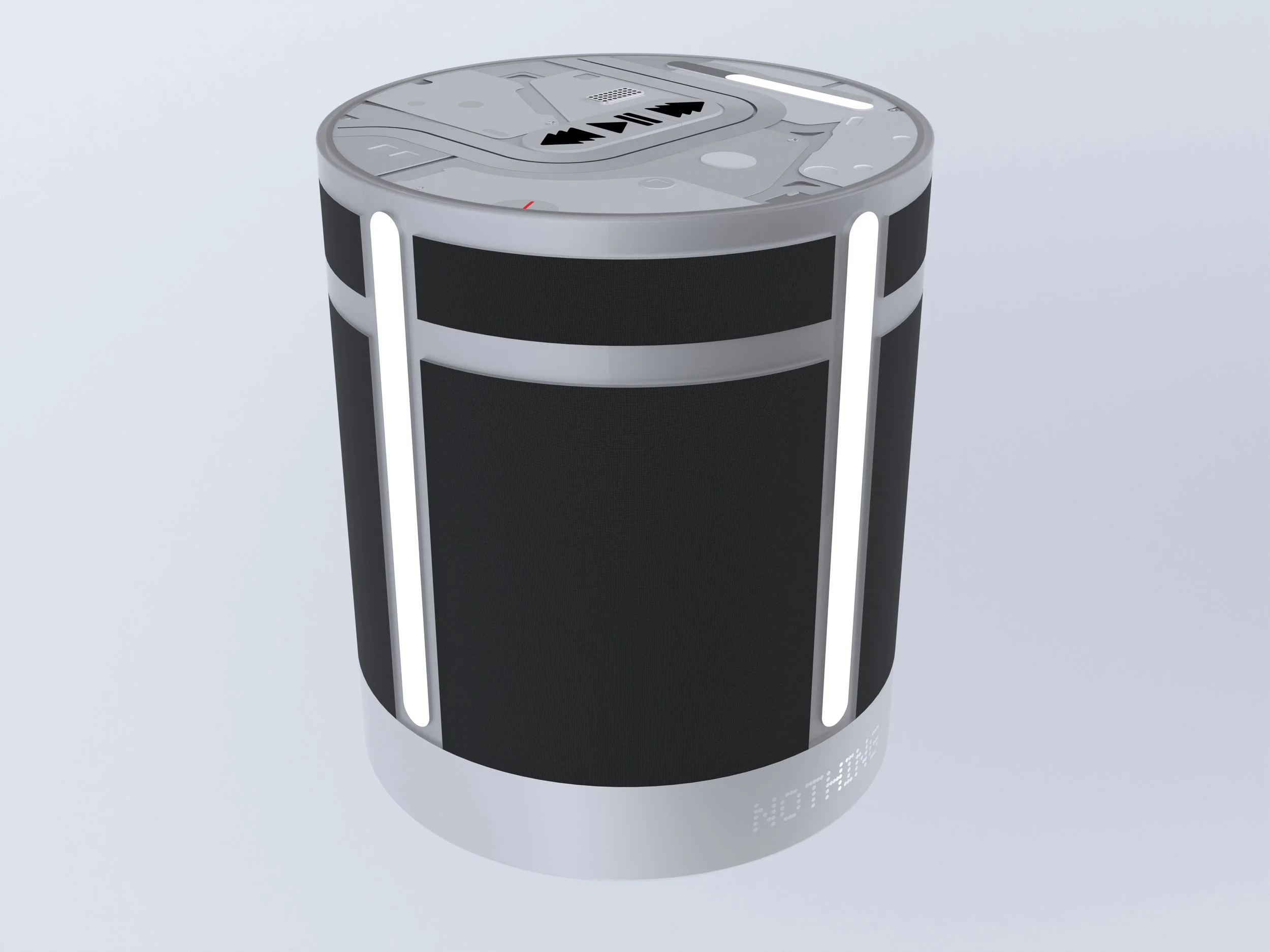
I drew inspiration from the 2013 Mac Pro, which had a cylindrical shape. Taking this silhouette, I shaped the enclosing dual speaker system. Looking at the top of the speaker, I had to find a way to make it simple to use and understand while still being in the Nothing design language. Doing this required me to use a design grid based on the golden number - (1.618)
Development:
Goals:
The initial goal for this project was simply to create a home smart speaker in the style of Nothing.
However, it quickly evolved into the interesting challenge of making something that could sit well and blend in with someone’s home most of the time but then when interacted with, it could become a much more involving experience.
Research:
As well as existing speaker research, I looked into Nothings design style as a company and how they put together their complex yet harmonious designs. Looking into it, I found out that they use design grids based on an element of the design or a number to achieve this harmony. So, I did the same, using the golden ratio number to harmonise the top design.
I also researched the acoustic dynamics of where a tweeter, full range and subwoofer are each needed and when.
Direction decisions:
I decided to go for a cylindrical shape, taking inspiration from the 2013 Mac Pro. This smooth and approachable shape allow it to blend more easily into the average modern home.
A circular shape also gives the impression of a 360 degree experience which, when combined with a dual tweeter and full range speaker system, should provide an immersive experience.
The glyph system will also synchronise to the music to give a visual experience as well as an audible one.
Controls:
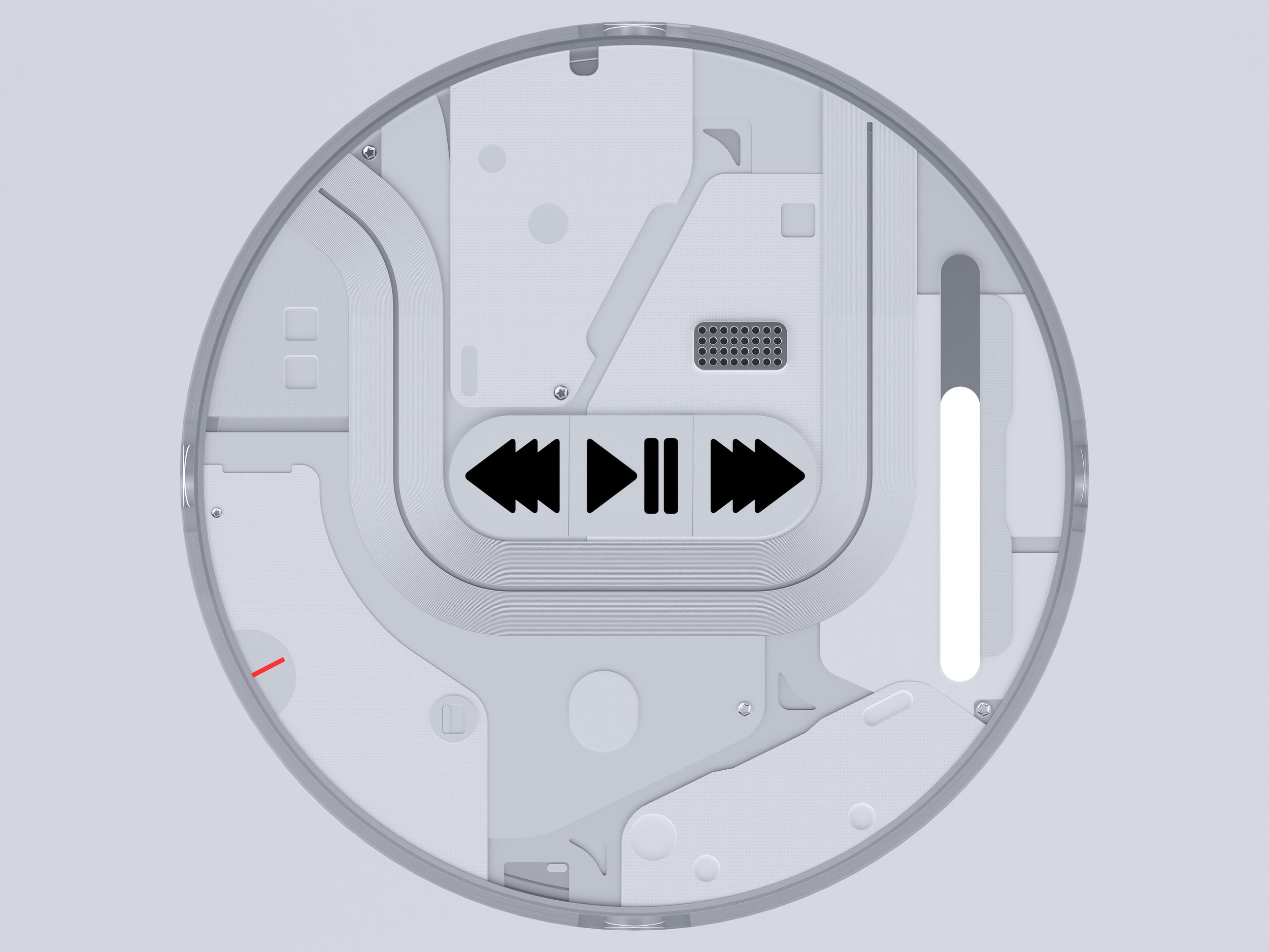
It was vital that the controls for this speaker were as clear as possible. To do this, the central buttons have black indication symbols to make it very clear where to press. The lack of an on/off switch is due to the fact this product is stationary and will be plugged in, so there is no need to turn it off, simply unplug it.
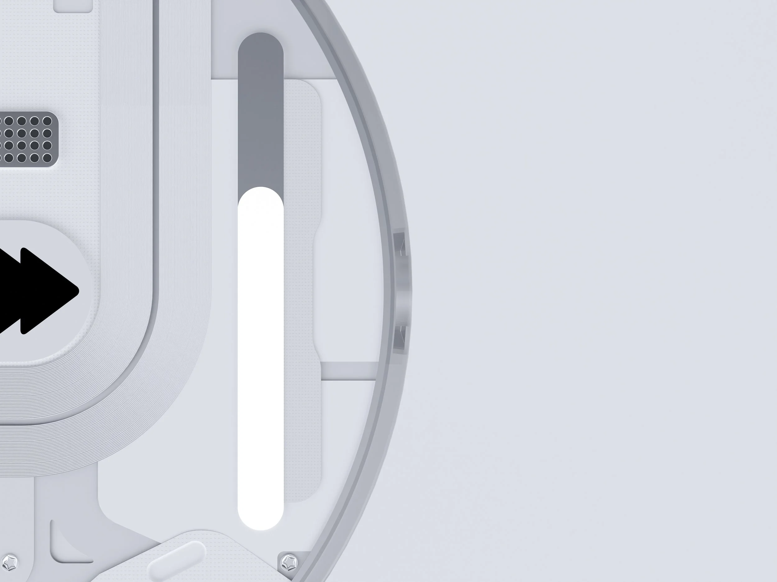
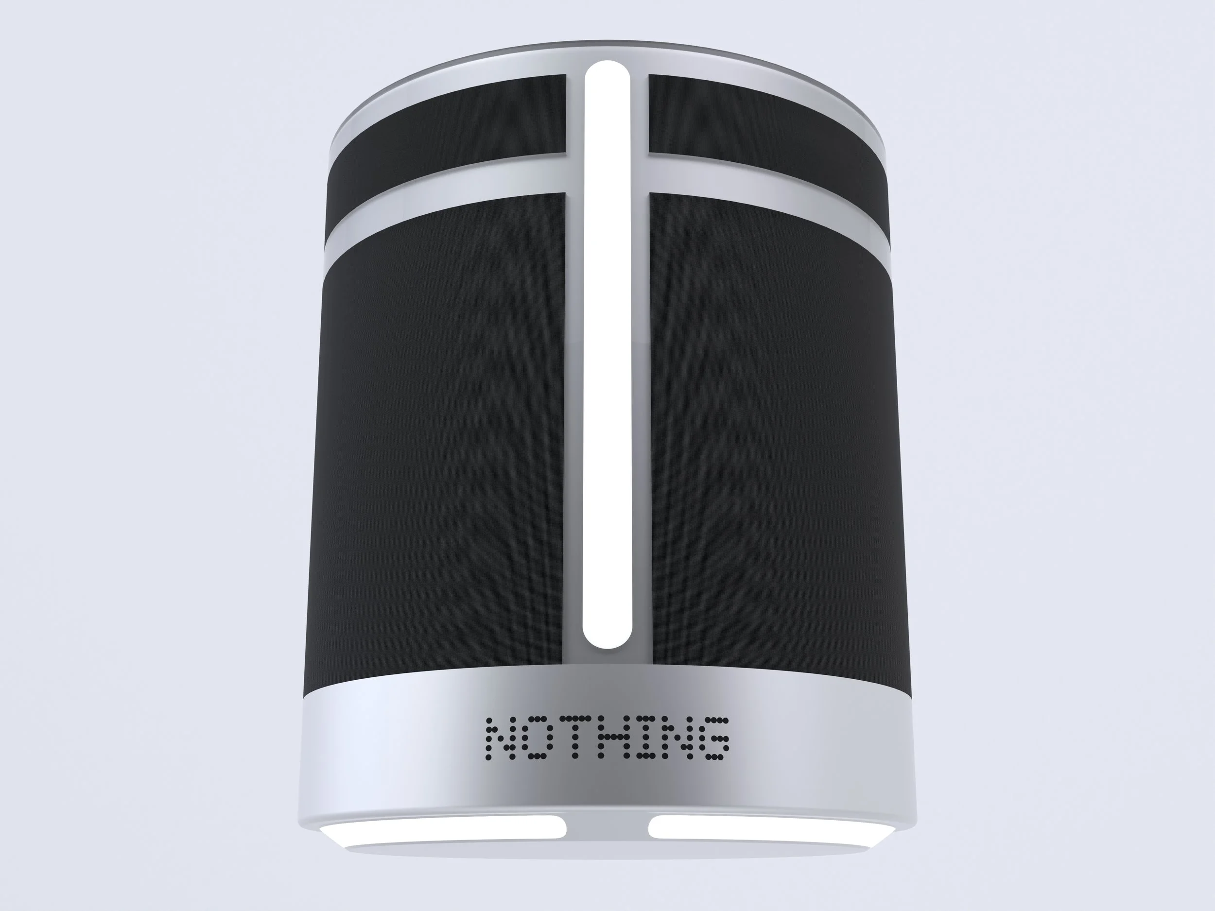
The touch glyph is an idea that expands upon the visual indication of the glyph system, and becomes a way to control it too. The user simply drags their finger on it and as the light goes up, so does the volume.
Additional considerations + feedback:
The overall build of the speaker is based on an aluminium build with clear polycarbonate to cover the top and add transparency to the sides.
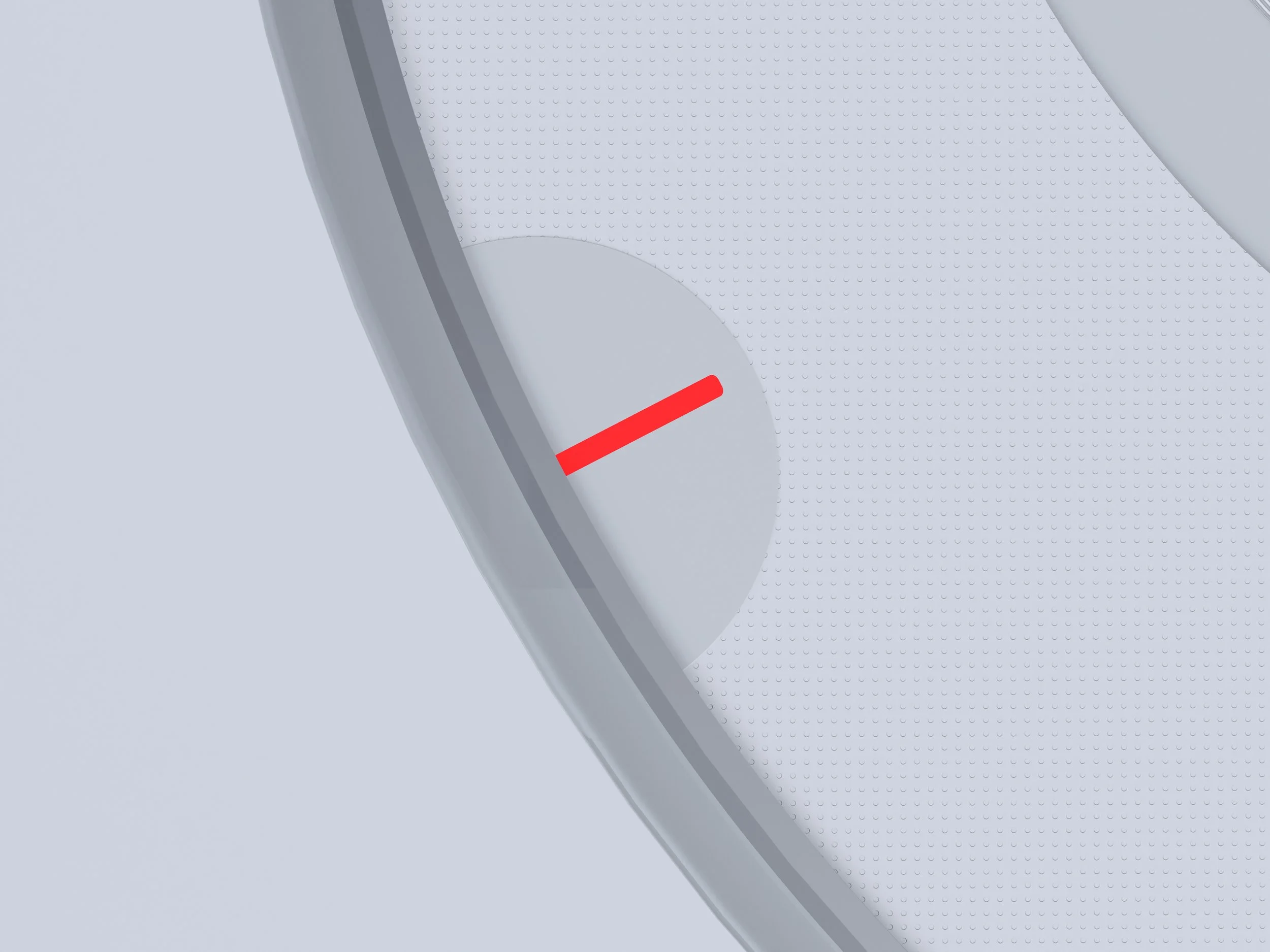
The single small and red “recording” light on top, indicates if the speakers microphone is active for calls or digital assistants.
Feedback wise, I posted it to the Nothing online community and got some great feedback that people would like to see it be actually manufactured and sold. Going into another version, I’d like to reduce the amount of glyphs and go for more visible aluminium.