Nothing Record - (2) [concept]:
Key take-aways:
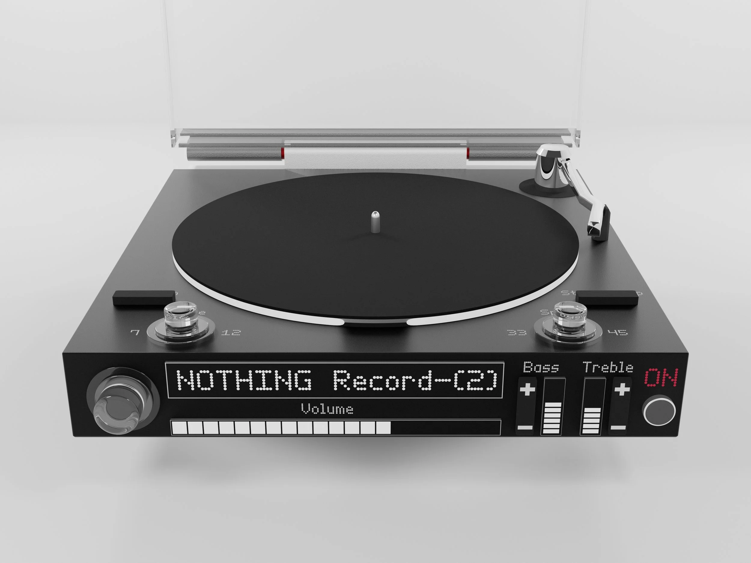
This is my self-directed second iteration of a record player in the style of the Nothing design company. I took the feedback I got from the official Nothing design team and then made improvements to create this version.
Featuring a new colour scheme, clearer information communication and a simplified control layout, the Record - (2) has improvements across the board.
Development:
Goals:
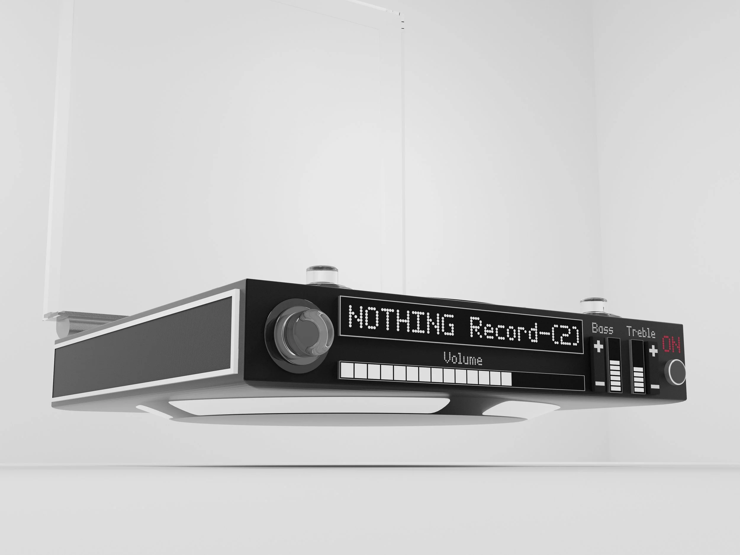
The main goal of this project was simple… improve.
This meant making several of my own improvements and implementing the feedback I got from the design team at Nothing.
Direction decisions:
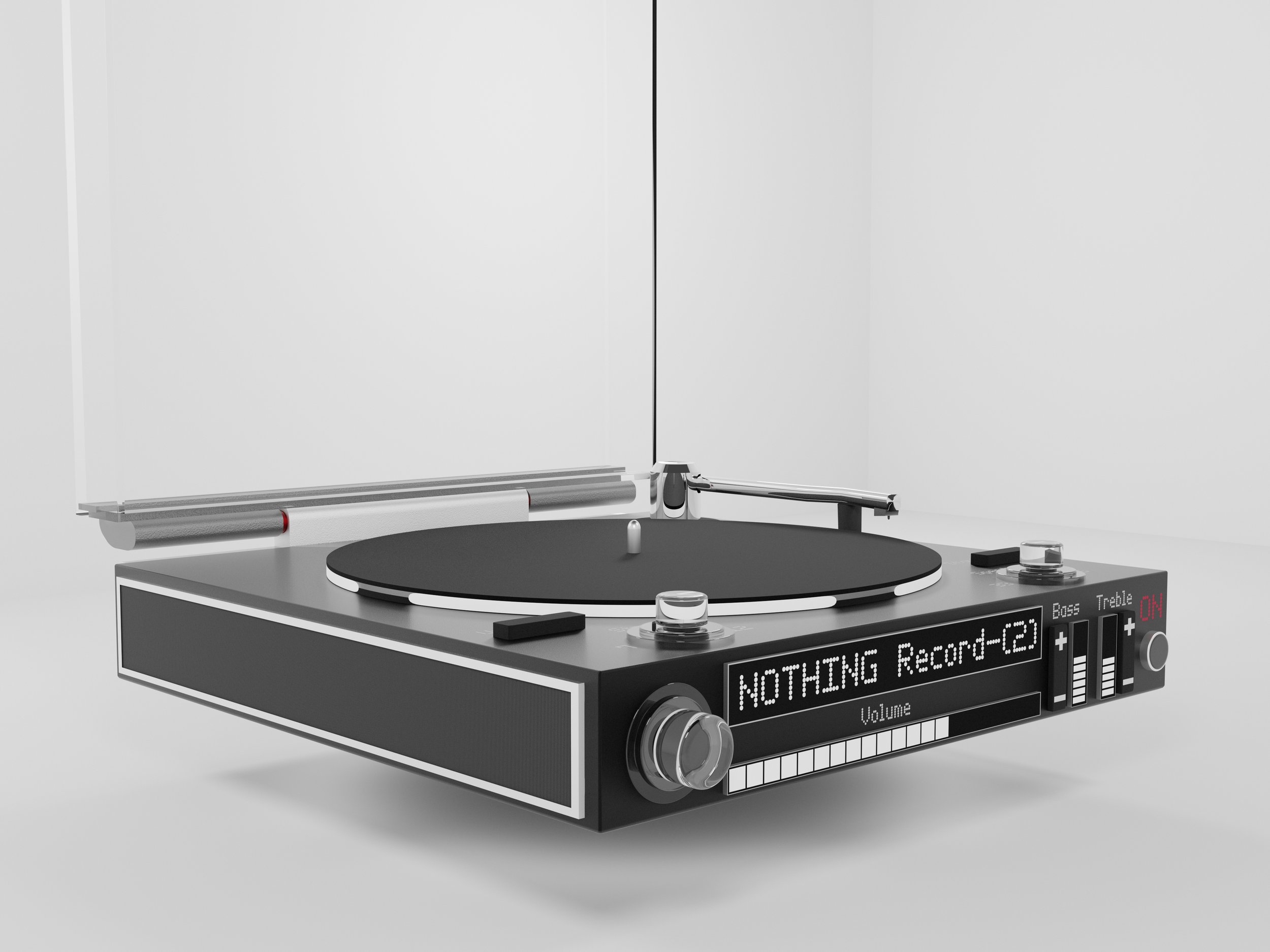
To start I knew I had to simplify it further by increasing its “first sight understanding”. This refers to making the device instantly understandable by only looking at it.
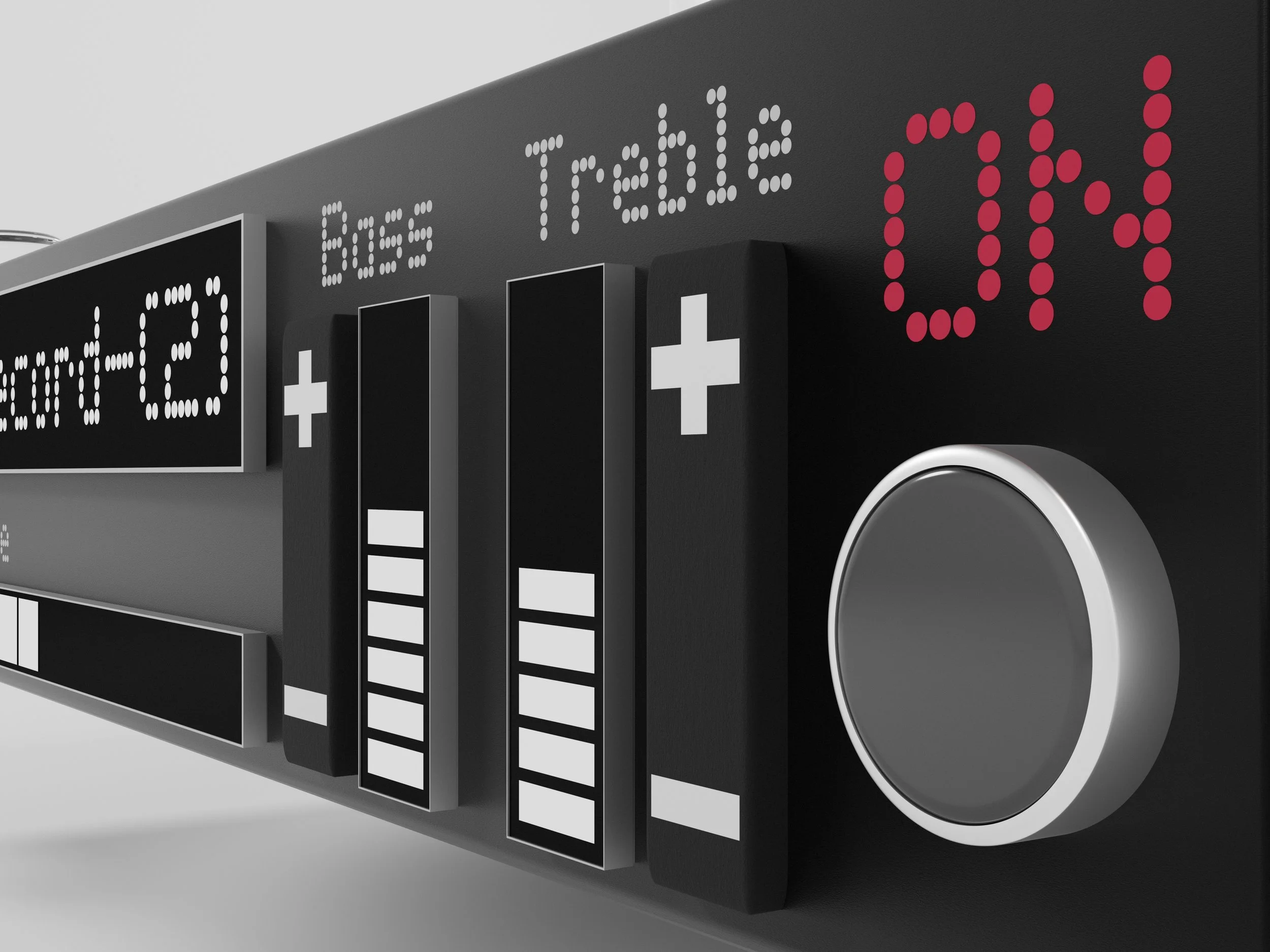
To do this I separated the; volume, bass and treble displays from the main one. While this results in a busier front, it makes it a whole lot easier to see information at a glance.
How it sits and fits:
For improving it’s ability to sit in a home, I listened to a member of the Nothing design team who told me that the record - (1) colours may have been too punchy for most homes.
To fix this I made the colour scheme black and white to go inline with their phone - (2) colours. I also removed the glyph bars from around the side speakers.
Physical controls decisions:
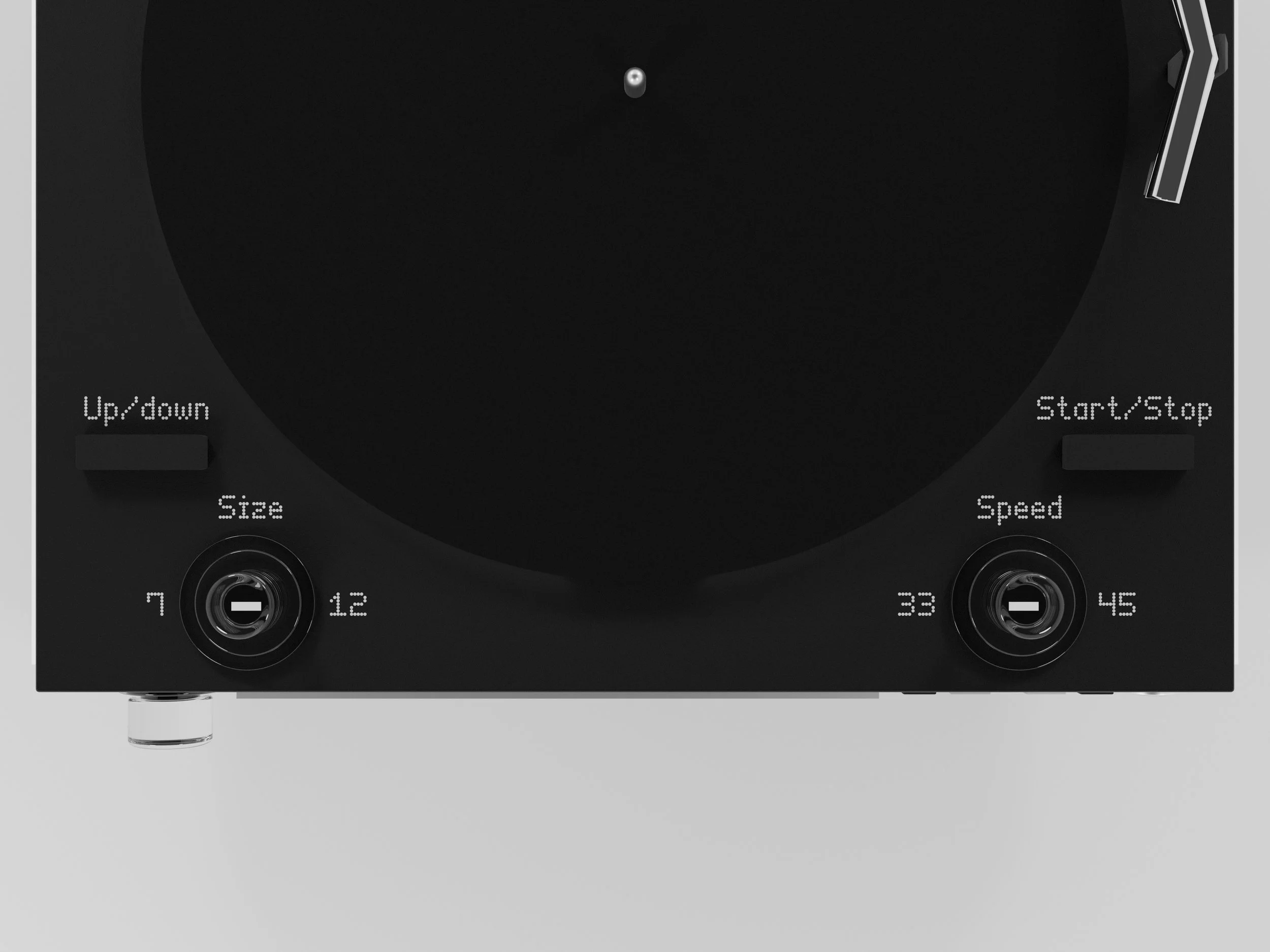
On the top, controls were combined and moved to make the layout symmetrical.
The bass and treble buttons made vertical for easier use with displays if they were horizontal a persons hand might go in front of them from standing view for the user.
The ‘ON’ button was also made into a clicky push button with a red light inspired by a ‘recording’ light.
Feedback + Next steps:
I got some great feedback from my design teacher and others that said they enjoyed the improvements on this version.
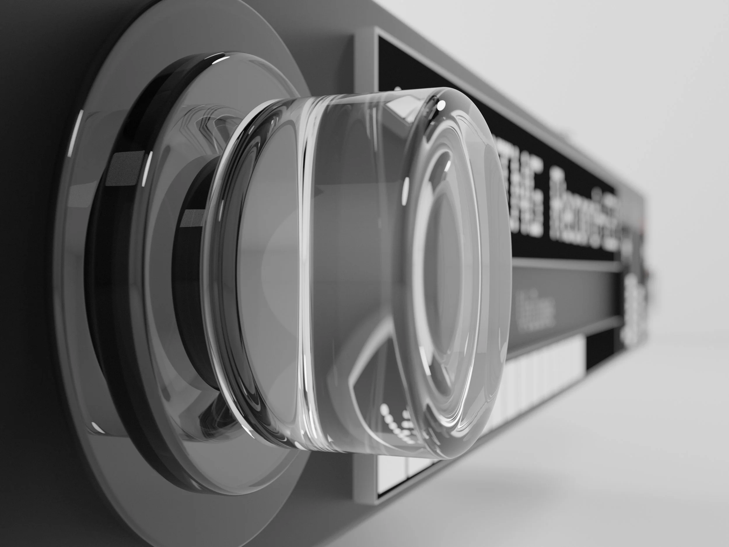
Going forwards into a potential Record - (3) I would like to do a ground up redesign to make it slimmer, simpler and to include more elements of transparency.